
Accessibility Guide for Web Apps
For Vega Web Apps, we suggest you follow the guidelines from WCAG (minimum AA), and WAI-ARIA. WCAG covers all the aspects of the accessibility.
The goal of accessibility is to deliver a TV app that supports users with the following types of disabilities:
- Visual: From color blindness to complete blindness.
- Mobility: From limited dexterity to difficulty performing gestures.
- Speech: From accented speech to using something nonverbal (if using voice input).
- Cognitive: Including learning disabilities, difficulty with complex instructions.
- Hearing: From partial to complete hearing loss.
A WebView could be an HTML, ReactJS, or Angular app. An accessible WebView includes 3 layers:
- Web apps: The developer must write and implement accessible code.
- Vega WebView wrapper: The Vega team provides this WebView wrapper.
- OS: The OS provides all required accessibility support and APIs.
Vega WebView wrapper
To make your HTML/Angular/React app a Vega Web App, wrap it with the Vega WebView wrapper.
The focus should go inside your app, with the following requirements:
- Set the initial focus to the app container.
- Expose TV-remote events (DPAD, Select) as keyboard events.
- Test the app with assistive technologies on the device.
Web apps
Focus on this layer to make your app accessible. In frameworks like VueJS, ReactJS, React Native, React Native for Vega, and AngularJS, write using JSX or HTML-like templates.
Resources to explore
Accessibility guidelines
Use the following guidelines to implement accessibility.
Semantic HTML structure
- Use meaningful HTML tags. For example, use semantic HTML tags like
<header>,<footer>, and<nav>. For buttons, use the<button>element instead of<div>or<span>. For links, use<a>instead of non-semantic elements. The platform recognizes these semantic tags and assistive technologies, such as VoiceView, Screen Magnifier, and TextBanner. The system handles most accessibility automatically when used correctly. - Use a hierarchical heading structure: Maintain ordered headings in your app, from
<h1>to<h6>. Hierarchical headings helps screen readers and other assistive technologies understand the content hierarchy, which improves overall navigation.
Accessible Rich Internet Application (ARIA) tags
- Developers may need non-semantic elements, such as custom components like tiles, cards, or carousels. In such cases, use ARIA attributes to communicate the purpose and behavior to assistive technologies.
- In simple terms, ARIA attributes help provide three key types of information:
- What the element is. Example: role="button"
- What it does. Example: aria-pressed, or aria-expanded
- Additional context or labels. Example: aria-label, or aria-describedby
- For a list of ARIA tags, properties, and methods you can use, see the ARIA Authoring Practices Guide.
- Example of ARIA usage:
<section aria-labelledby="features-title">
  <h2 id="features-title">Accessibility Features</h2>
  <p>This section describes how to make your content accessible.</p>
</section>
Alt or image and icon descriptions
VoiceView doesn't understand images or graphics. Therefore, provide an alt or meaningful description. For example, for a settings icons, use a description like "settings" rather than "an image of a settings icon" or "an icon." VoiceView adds "an image…" or "link image…". Adding text like "an image" or "an icon" is too vague.
<img src="" alt="Settings">
- Decorative Images: Skip the alt tag for purely decorative images with no user value.
- Repeating Text: Don't repeat nearby text in the alt tag or aria-label if the image already contains it.
Focus management
- Focus to an element should be visible and clear. Follow the WACG guidelines.
- If you're' using semantic HTML tags (button, and a), by default you'll see the focus ring, or you can customize according to your app's design and VoiceView can identify and read out aloud.
- For the initial focus, use the React/Angular
autoFocusprop. - If you use a non-semantic tag, then write custom JavaScript code to apply focus, and a custom style
onFocus. - Use
tabindexonly when- You're making a non-focusable element focusable.
- Customizing focus order carefully, which affects modals and custom components. ```html
Focusable div using tabindex// tabindex makes an element focuable ```
- Letter spacing: Keep it consistent and avoid overly tight or loose spacing.
- Avoid all-caps: Especially avoid all-caps for long sentences, because it's harder to read.
- Line height: Use at least
1.5(or150%) to improve legibility as per WCAG. - Maintain consistent typography.
Programmatic announcements
There are options for developers who build software without tags or who don't announce information programmatically. These options are useful for web apps that use canvas to draw charts, diagrams, interactive navigation, or 3D world elements.
Option 1: Use a div for announcements and update the text used for announcements.
<!-- index.html -->
<div id="announcer" aria-live="assertive" aria-atomic="true"></div>

<script>
  const announcerDiv = document.getElementById("announcer");

  // Simulate an update
  setTimeout(() => {
    announcerDiv.textContent = "New Announcement!";
  }, 5000);
</script>
Option 2: Use postMessage to send a message to the Vega WebView container and then handle this message using onMessage. In onMessage, invoke AccessibilityInfo.announceForAccessibility();. It takes a little more setup but ends up operating similarly to how SpeechSynthesis works.
SpeechSynthesis is currently not supported by the WebView component. It is possible to create an implementation using postMessage and onMessage to an extent. There are some behaviors that cannot currently be mimicked with AccessibilityInfo.In this example, a type-value message pattern is used much like JSON API or socket data industry standards. When messages are sent or received, it is easier to serialize and deserialize different data types. The top script is the web app while the bottom is the Vega Web App code.
<!-- index.html -->
<script>
  const message = JSON.Stringify({
    type: "announcement",
    value: "New Announcement!"
  });

  // use postMessage to send data to Vega Web App.
  window.ReactNativeWebView.postMessage(message);
</script>
// App.tsx
import { AccessibilityInfo } from "@amazon-devices/react-native-kepler";

export const App = () => {

  // implement to return value if the type is "announcement"
  const getAnnouncement = (message: string) => {};

  return (
    <WebView
      source={{ uri: 'https://amazon.com' }}

      // use onMessage to receive data from postMessage
      onMessage={(event: WebViewMessageEvent) => {
        const announcement = getAnnouncement(event.nativeEvent.data);

        // announce
        AccessibilityInfo.announceForAccessibility(announcement);
    }}
    </WebView>
  );
};
Typography and color
- Font sizes must meet readability criteria.
- Use a color contrast ratio ≥ 4.5:1 for normal text and ≥ 3:1 for large text. As per WCAG Check https://webaim.org/resources/contrastchecker/
- Visual focus should use a different color than the background
- Font family should be easy to understand. Avoid using too cursive or light
- Line height should make the content easy to read
and many more.
VoiceView
Test with VoiceView to avoid redundant announcements, maintain a correct reading order, and enable live updates (aria-live). Check the FAQ for common issues.
Test Playback, Alexa , and other Audio behavior.
To hide non-interactive content from the accessibility API, use aria-hidden="true". Check the MDN docs for details. The following is example content.
- Purely decorative content, such as icons or images
- Duplicated content, such as repeated text
- Offscreen or collapsed content, such as menus
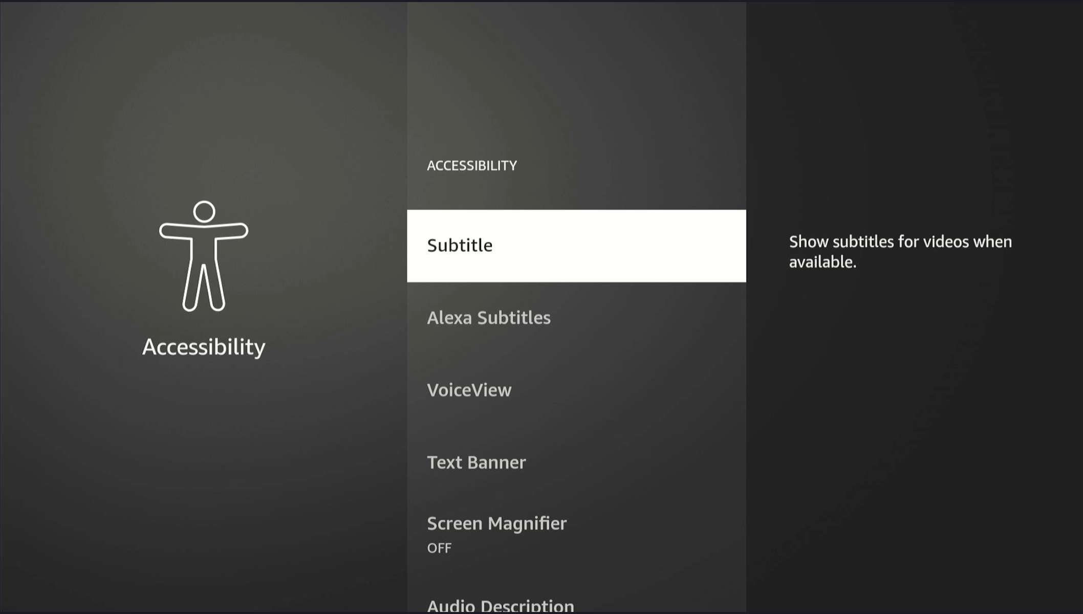
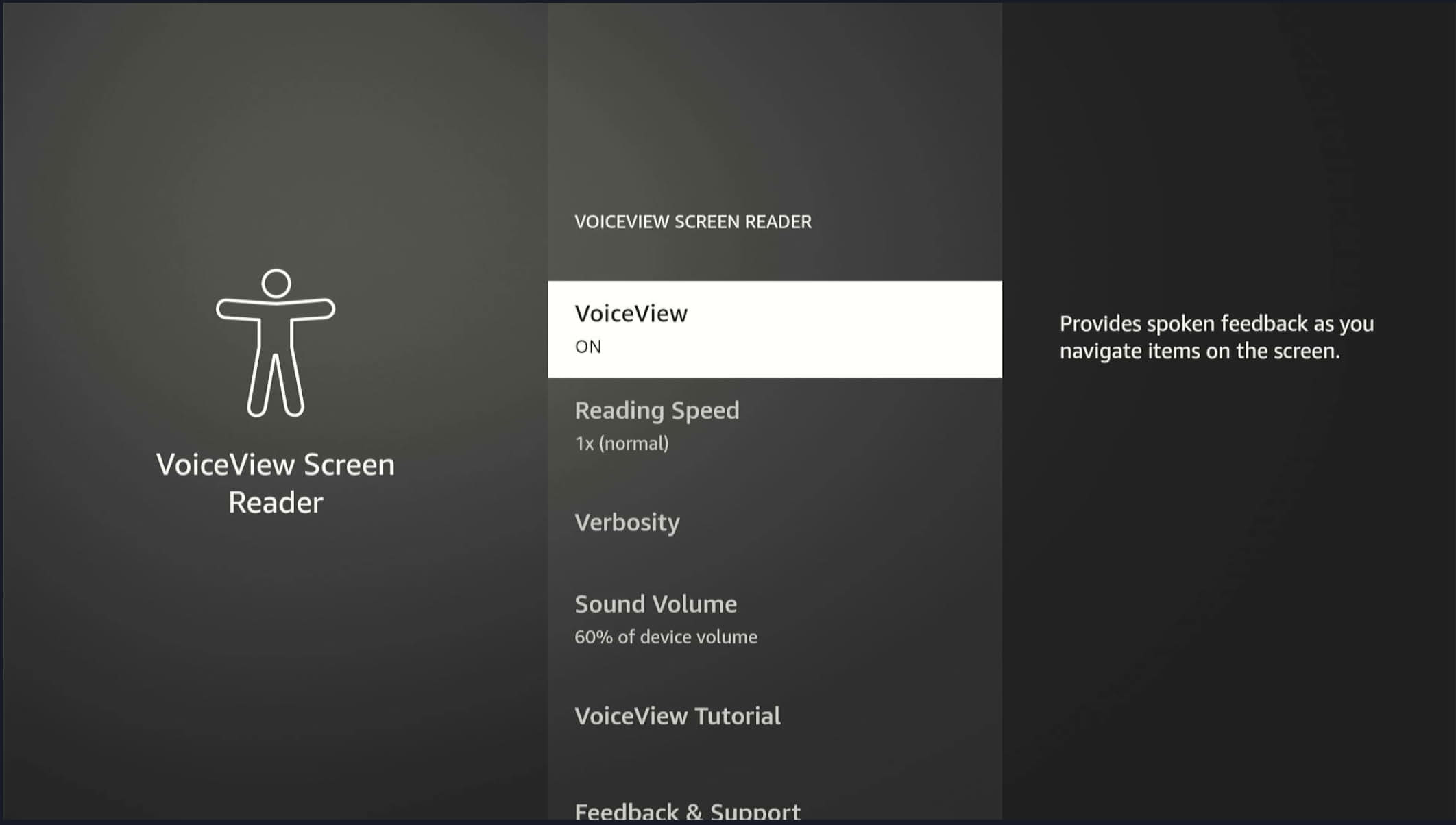
Accessibility features in Vega WebView
- TV Remote (DPAD, Back, Select)
- VoiceView (screen reader)
- Magnifier (screen zoom)
- Captions/Subtitles
Enabling accessibility elements in WebView
Enable VoiceView
- Navigate to Accessibility Settings
- Toggle VoiceView ON
Hide elements for VoiceView
To hide VoiceView elements, use the following.
aria-hidden="true"
How to notify VoiceView of an element when the default accessible name is missing
Use the following so that VoiceView knows about the element.
<button aria-label="Close dialog">X</button>
Announcing dynamic values
HTML, ReactJS, Angular uses aria-live. For more details, see ARIA: aria-live attribute. Use the following to announce dynamic values.
<div aria-live="polite" id="status"> <!- Text inserted here will be announced --></div>
Test cases
We suggest these minimum test cases. You may use them for your app's accessibility testing.
VoiceView
Enable and disable VoiceView
- Navigate to Accessibility Settings.
- Toggle VoiceView ON/OFF.
Use the app with VoiceView enabled
- Enable VoiceView.
- Navigate through the app using your remote.
- Verify voice prompts for each UI element.
Verify new screen spoken text
On a new screen, the header, description, usage hints, orientation text, and currently focused item are spoken.
- Navigate to different app sections (For example, Home, Settings, Content).
- Confirm VoiceView output.
Verify navigation and spoken elements
Make sure a user can navigate (using directional pad/select/quick select actions on buttons) to all actionable elements. The focused element must be spoken in full, and static text for that element must be spoken in Normal Mode.
Verify the spoken focused element after a pause
You should hear spoken Usage Hints, Orientation Text, Described By, and Static Text after a short pause (~0.5 seconds).
Verify images and icons include descriptive text
If images provide instructions, describe all instructions in the alt-text so VoiceView will speak.
Verify VoiceView in Review Mode
Hold menu for 2 seconds with VoiceView on. The user should be able to navigate (Left/Right on directional pad) to all text and controls, with change in granularity (Up/Down on directional pad). User must be able to read non-actionable text and items in Review Mode.
Verify accessibility gestures
For instance, double-click to activate an item, or long press.
Magnify (screen zoom)
Enable and disable magnification
- Go to Accessibility.
- Enable Magnifier.
- Verify it zooms in/out.
Zoom functionality across UI
- Try zooming text, buttons, images.
- Confirm proper scaling and visibility.
Zoom preserves readability and doesn't clip content
- Zoom in/out on all screens.
- Verify that the layout is unchanged and that scroll works.
1.5x zoom for 1st time
- Go to setting.
- Make sure zoom is off.
- Activate zoom.
- Observe zoom and app behavior.
Zoom preserves as per user's preference after 1st visit
- Go to setting.
- Make sure zoom is off.
- Activate zoom.
- Observe zoom and app behavior.
- Close the app.
- Reopen the app or power on the device again.
- Verify the zoom level is preserved from before.
Verify magnifier on focus
Make sure the user can navigate (using directional pad/select) to actionable controls and that the magnifier follows the focus.
Verify the user can explore (using menu+directional pad to Pan) all text and controls
Subtitles / captions
Enable and disable subtitles
- Play video.
- Toggle subtitles in player/settings.
- Confirm visibility.
Verify the user can set styles for Closed Captioning
Use CC Settings in your Local player while on the Global setting.
- Change subtitle settings.
- Verify UI updates accordingly.
Subtitles persist across sessions (if applicable)
- Enable.
- Exit app.
- Reopen.
- Check if the setting persists.
Subtitle accuracy and sync with audio
- Play content.
- Confirm subtitles are in sync and accurate.
Verify the user gets accurate Closed Captions
Make sure your captions only have a short delay and that they follow the content.
Font / text size
Increase and decrease text size
- Access font settings.
- Adjust size.
- Verify text scales correctly across UI.
Font changes remain across the app
- Change font size.
- Navigate to different screens.
- Confirm consistency.
No layout breaking with a large font
- Set maximum font size.
- Verify no UI clipping or overlap.
Focus / visual indicator
Every actionable element has a visible focus ring
- Use remote to navigate through all UI.
- Check the focus ring on each element.
Consistent focus order (logical navigation flow)
- Navigate using the remote.
- Confirm intuitive focus order (top-to-bottom, left-to-right).
Optional: Audio feedback on focus change
- Enable audio cues.
- Navigate.
- Confirm audible indication on focus change.
Focus is not lost after user action, such as on modal close
- Open and close modals or dialogs.
- The focus returns to the expected element.
Navigation
Navigating with the remote is accessible
- Use D-pad, Back, Select buttons.
- Verify all areas are accessible without touch input.
Keyboard navigation support (if supported)
- Test with an external keyboard or accessibility input device.
- Verify all interactive areas.
No trap zones (can navigate away from all areas)
- Try entering/exiting modals, menus, and carousels.
- Verify there are no dead ends.
Latency
Verify accessibility metadata loads as part of a standard payload package
Verify the user receives a visual and audible notification that the content is loading on screen
Verify the user is not blocked if the connection times out
Verify they are not blocked even if they are offline.
Accessibility by design
Verify images and icons include descriptive text
If images provide instructions, add these instructions to the alt-text for VoiceView to speak.
Verify status communicates through multiple means
Communication means might be text, color, and sound.
Verify all icons have a text description
Even commonly used icons need text descriptions.
Troubleshooting
If VoiceView doesn't speak any items when it's enabled
Check the accessibility markup.
If a UI element reads as a button
This behavior occurs when UI elements don't have accessibility labels or descriptions, but they have accessibility roles set as button.
If UI elements are different from what's visually displayed
This difference may be because the app didn't properly set the focused element for accessibility.
If VoiceView speaks the title or UI element more than once
Repeated spoken items may be due to duplicate A11Y announcements. Remove all duplicate A11Y announcements.
If video playback results in continuous reading
Continuous reading may be from an incorrectly used label. The focus is on content details instead of the video player component, which has no text inside it. The app should only focus on the element/node when it's visually on the screen during video playback.
Audio ducking is not working
If VoiceView starts to speak during video playback, VoiceView speech gets priority, and the video playback audio should duck (lower volume).
Related topics
Last updated: Feb 04, 2026